To build an online marketplace app the first step is to scope out the competition! What is already out there? What are some popular apps that do what I want to achieve and what can I learn from them? I called out a few well-known apps when I was brainstorming, so I will start there.
Facebook Marketplace

The Facebook app is packed with features. Marketplace is one of the six available sections in the app. Marketplace products are tiled in rows of two. As such the preview images for these products are quite large. This also makes the adjacent ads monetizing the app more visible as well. I don’t like how close the products are to each other in this tiled layout. There is so much real estate to work with, yet the lack of spacing between the products make it feel cluttered.
The best feature of Marketplace is when you click on a product to see more details, the transition is seamless. It expands upon the product’s preview image and then finishes loading the metadata / details afterwards. Other apps tend to show a noticeable loading indicator, but Marketplace is able to almost avoid it by using this transition technique.
When looking at a product, the product images are the most prominent part of the listing. You can swipe through multiple images in a carousel gallery with dot navigation. All pertinent information about the product and the product’s seller is clearly laid out in Facebook’s signature color themes. There is also a small map showing the seller’s approximate location. Beyond the product’s information, it is a bit cluttered with either ads or related products.
Facebook is built on a mixture of technology, but Marketplace itself is built on Facebook’s own React Native.
Craigslist

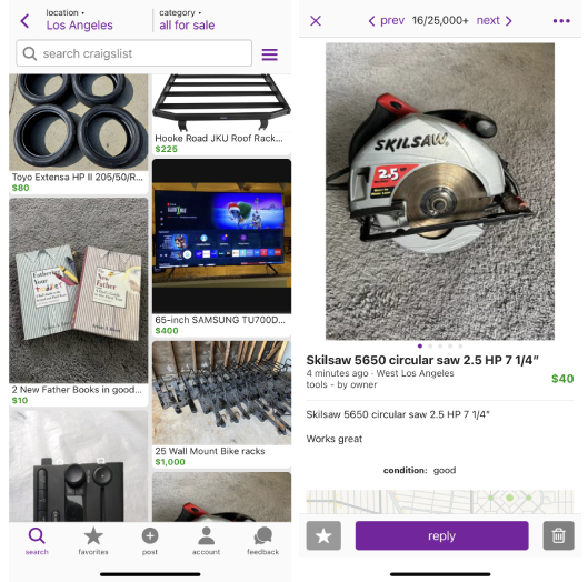
Craigslist is the oldest and most recognized name in this list. It has been around since the 90s as a website and retained almost the same minimal vintage text-based design throughout. Any updates have been very minimal over the years. Craigslist finally added Android and iOS apps a few years ago. The apps follow the same simplistic design as its website counterpart.
The “for sale” category is Craigslist’s online marketplace. Products are organized in a cascading fashion, also two per row like Facebook Marketplace. I’m not a fan of the cascading layout at all. In my opinion, cascading layouts only work if they are purely images. Cascading images along with titles and prices included make it look unstructured and messy.
Product images for a listing use a carousel gallery and dot navigation similar to Facebook Marketplace. The product text descriptions are way more lengthy. Not much information is given about the seller but you can click to contact them. There is also a large map showing the seller’s approximate location. The map size can probably be reduced by more than 50%.
There is no information on what language and technologies the Craigslist apps are built with. If I had to guess it’d be one of the cross-platform frameworks such as Flutter or React Native.
Mercari and OfferUp

Mercari and OfferUp are also popular online marketplace apps. Both of these apps chose to organize their products in rows of three. The user can see more products at once but it feels a bit compact. Mercari’s UI is better with a bit of spacing compared to OfferUp which tiles their products very closely together alongside ads that are taller than the product images. When users click on a product to see more details, both apps use the same “slide in from the right” transition animation.
The product details view for both Mercari and OfferUp are very similar to the other online marketplace apps I’ve mentioned. The image gallery is the first thing you see. OfferUp is the only app that uses image thumbnails as navigation for the gallery. I can see how this works better if there are more than a few images for a particular product. I plan to limit how many images that can be uploaded for a product listing so dot navigation will probably work better. As you scroll down you get details about the seller following the product’s description.
Overall I like Mercari’s design better than OfferUp. Mercari allows purchases to be processed within the app. I do not plan on adding this feature to Keep It 100. Mercari and OfferUp are also built on React Native. Their respective decisions for using React Native as part of their stack is described in their blogs.
Nextdoor

Last but not least, my winner in overall design is Nextdoor. Nextdoor is a social media platform for local neighborhoods. It also has a “For Sale” section. Products are tiled in rows of two like Facebook Marketplace. But they’re more adequately spaced out. Nextdoor made good use of the available screen real estate.
Nextdoor’s product details view resembles that of Facebook Marketplace. Information about the seller is available immediately after the product images gallery, product title and price. The product description is abbreviated with the option of clicking to see more. I like this feature but I’m not sure how much I will need it as there will most likely be a word count limit for product descriptions on Keep It 100.
Nextdoor’s mobile app is built with Swift on iOS and Kotlin on Android. When I navigated through the app I did not see any noticeable difference in terms of speed and performance compared to the apps built on React Native.
Reviewing the features of all these apps will help me in my own design process. I like Nextdoor’s overall design but it is not perfect. The other apps also have features that I’d like to adopt. I will compile everything together and create something new!